

Selection framework.
The design.
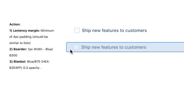
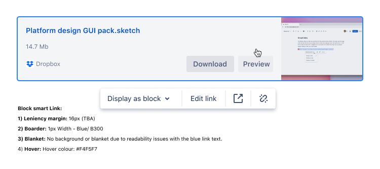
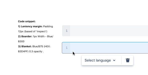
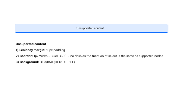
We encountered various design inconsistencies with our selection. I undertook a comprehensive audit of our existing selection, categorizing user feedback through our feedback portal to gain a holistic understanding. The key issues identified included: users struggling to discern selected elements, a lack of consistency in selection methods and styles, and the presence of multi-select bugs.

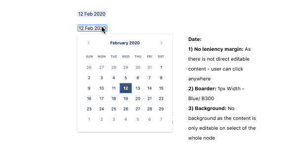
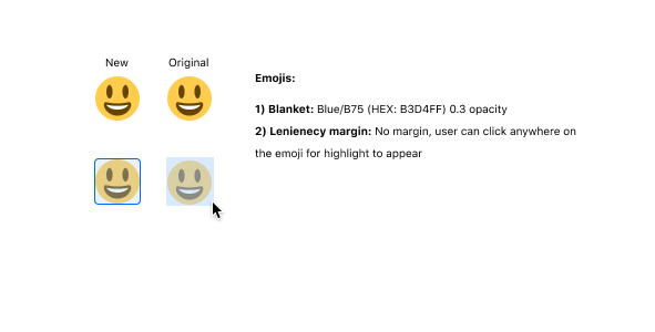
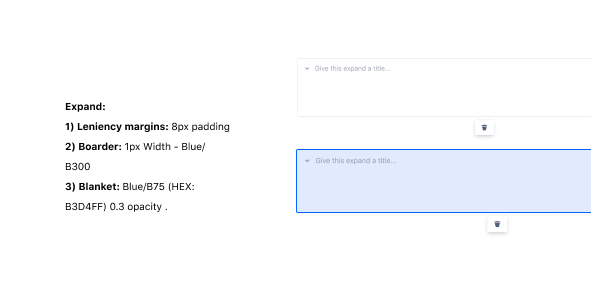
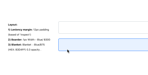
The project's overarching goal encompassed the creation of a new style guide for selected states, ensuring accessibility through both mouse and keyboard interaction, adapting designs to meet diverse element requirements (e.g., removing the blue overlay for media), and crafting a comprehensive rules page to serve as a reference for fellow designers.
-
![]()
Actions
-
![]()
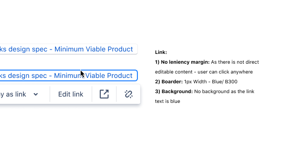
Link
-
![]()
Code snippet
-
![]()
Unsupported content
-
![]()
Date
-
![]()
Dividers
-
![]()
Emojis
-
![]()
Expand
-
![]()
Mentions
-
![]()
Media
-
![]()
Layout
-
![]()
Inline links
-
![]()
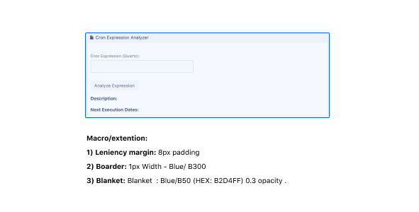
Macros
-
![]()
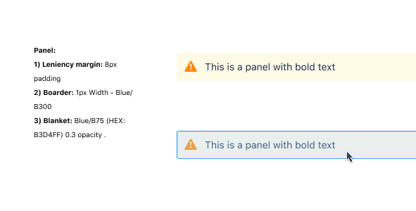
Panels
-
![]()
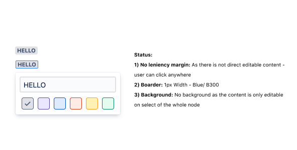
Status
-
![]()
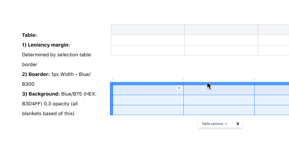
Tables



The process.
-
I conducted a user feedback analysis, categorizing the data to pinpoint key pain points. In tandem, I performed an audit of our existing user experience. To shed light on the origins of the inconsistency, I engaged in interviews with former team designers, leading to the inclusion of a crucial 'framework' component within the project's scope.
-
I delved into our existing Atlassian design system, crafting a universal selection style that could be flexibly adapted depending on the specific requirements of the selected element, such as visibility considerations for media elements. Additionally, I established a framework, defining which style to apply to various elements, thereby safeguarding against the recurrence of inconsistencies in the future.
-
I collaborated closely with our engineering team to craft a series of detailed Jira tickets, leaving no element unaddressed. Throughout the project's lifecycle, I adjusted designs to align with shifting deadlines and varying developer capacities, yet our final deliverable remained resolute in its mission to alleviate user pain points.
The impact.
After the project was complete, we saw more than double the amount of users selecting content. Thanks to the framework, other teams were able to see how we set up rules for different use cases.